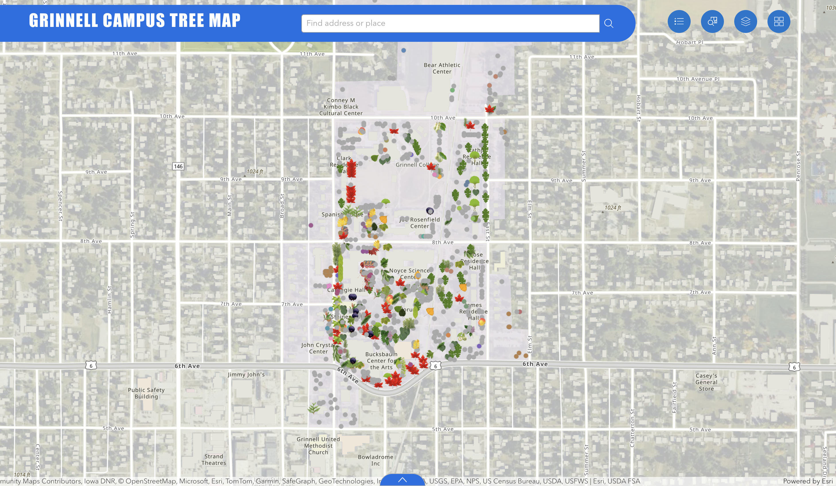
ArcGIS really is one of my favorite tools in digital humanities. This may be because I have had a few experiences with it before starting as a Vivero Fellow (and the more we know something the more we like it!). Using ArcGIS in a few different context really showed me the variety of uses for this program, as well as the way the maps can be customized to best convey desired message. I previously worked with information where I only displayed one variable — the geographical location of populations’ town of residence. I approached it by using uniform symbols that varied in size depending on the number of individuals they represented (which happens only when they overlap when “zooming out”). The Campus Tree Map I am working on this year has much more to show, but there are still some of the categories of information that are more important than others.
That’s how we got down to three variables we would like to display – species, genus and geographical location. This way, we can make the information straight forward without unnecessarily oversimplifying it.
ArcGIS is rather intuitive, but only to some extent. At some point, however, I find it necessary to go to a community support page. This speaks to the wide range for the uses of the program — there is a lot of features that I was not aware of at first but that changed my perspective entirely upon discovering.